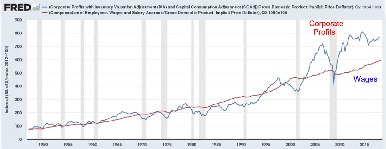
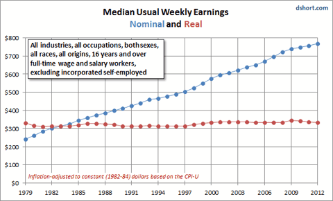
How this graph was created: From the release table about national income by type of income, check the two series and click on �Add to Graph.
|
Chapter 33 Distributing Income III. Analyzing the Distribution of Income IV. Causes of Income Inequality V. Poverty Defined, Creating a Safety Net VII. Politics of Poverty Programs VIII. Market Income Poor Measure of Well-being. IX. How Income Inequality Affects Growth X. What About Wealth in America 1-Page Quick Review-Chapter 33 Return to Quick Economics Notes 9/11/24 |
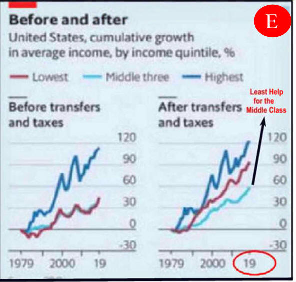
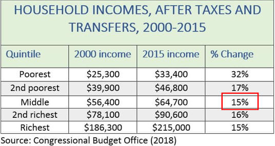
Middle Income Got the Least Help?
Please Use to Educate and Share 1/17/24 |
|
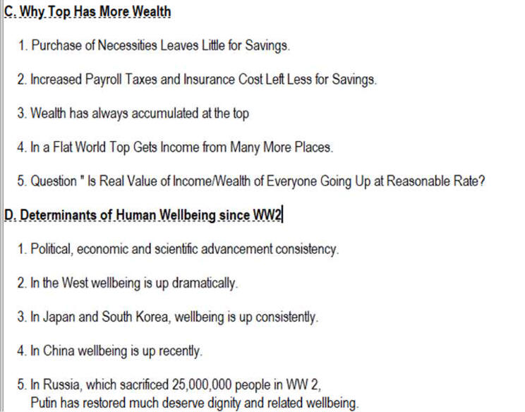
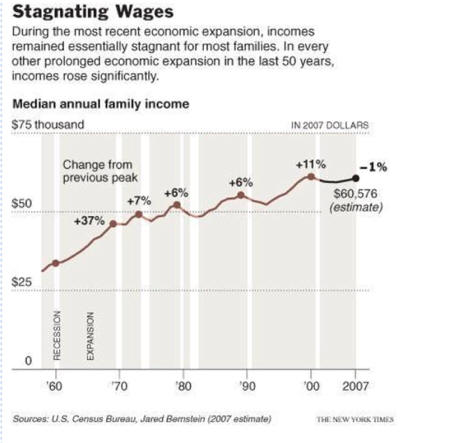
Lecture Notes I. Median Income StagnationA. Analysis B. Why the Top Earners Have More C. Determinates of Human Wellbeing Since WW2 D. Top Getting too much? See Career Handbook Wage Stagnation
1. Defining Middle Class Income
Analysis
2. Defining Class Range Median
|
Supplemental
5 Myths About Inequality What you should know about Poverty and Socialism Fake News Warning 7 Reveals a More Serious Real Problem See Why Poverty is Controversial In the US, Everyone Gets More
See Direct Education toward a student's Special Intelligence
Analysis:
Income Inequality
is exaggerated by Media and Politicians.
1)
Well-Being is Most Important
B) Scientific achievements have continuously added to citizen
well-being.
Do We Need to Know For All
Income Classes
|
|
From
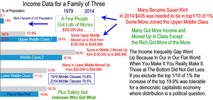
Upper Middle Class Growing
6/16 4. Everyone is moving up
5. Elderly Do Better
6. Poor Live Better
Since 1989
|
Federal Government Helps Much
US Spends Lots
But, Middle Feels Left Out
|
|
Income Stagnation After Oil Embargo
Before Stagnation: New
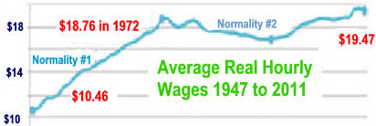
Normal #1 Rising Income
Oil Embargos and Competition Began early 1970's Wage Stagnation Japan's competitive manufacturing sector increased competition which caused stagnate Rust Belt wages and employment plus it put pressure on profit. Japan manufacturers got lucky when gas efficient small green cars required a change in the U.S. manufacturing process. Detroit responded by protecting profits with less product quality improving capital investment. Unions leaders protect their positions and current worker wages by accepting a two-tier wage system.
It minimized new worker wages.
C. American thoughts on Income Inequality from Wall Street Journal's Real Time Economics Blog |
US Country Wealth Distribution Similar
US Income Inequality is Getting Larger
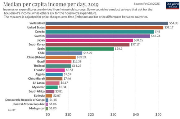
But US Median Income High
|
|
III.
Analyzing the Distribution of Income with
Lorenz Curves and Gini Index
But
Everyone is getting more! 1. CIA World Facebook Gini rank order 2. Gini in a Bottle: Facts on Income Inequality 3. Transfers and Taxes Decreases Inequality 4. U.S, Really Fail three GINI Test 5. Aging and Wealth Inequality in a neoclassical growth model is a mathematical look by the FED. economics, health science, ecology, chemistry and engineering. from Gini coefficient of Wikipedia 1. CIA World Facebook Gini rank order 2. Gini in a Bottle: Facts on Income Inequality 3. Transfers Payments and Taxes Decreases Inequality 4. U.S, Really Fail three GINI Test 5. Aging and Wealth Inequality in a neoclassical growth model is a mathematics look by the FED. Timothy Noah points to a study that shows Americans underestimate income inequality. �The richest 1 percent account for 35 percent of the nation�s net worth; subtract housing, and their share rises to 43 percent. The richest 20 percent (or �top quintile�) account for 85 percent; subtract housing and their share rises to 93 percent. But when Norton and Ariely surveyed a group whose incomes, voting patterns, and geographic distribution approximated that of U.S. population, the respondents guessed that the top quintile accounted for only 59 percent of the nation�s wealth� Norton and Ariely also asked respondents what they thought the ideal distribution of wealth should be, and found, again, little difference among income groups, or between Bush voters and Kerry voters. Most favored a wealth distribution resembling that in � Sweden! But when you examine Norton and Ariely�s method, that particular finding gets a little shaky. They showed respondents three unlabeled pie charts. One depicted utopian equality, with wealth distributed equally among five groups. |
n
|
|
See Income Inequality and It's Costs and Taxing The Top 1PercentIncome Inequality Analysis and Cures Public Policy Affects Income Inequality Income Inequality Exposed
|
Left axis is link between fathers' and sons' earnings.
|
|
Supplemental
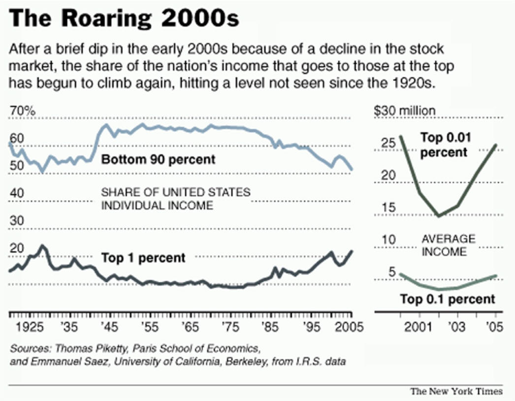
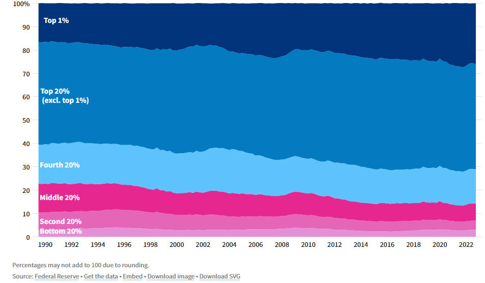
Answer: all of them had more wealth as while only the Top 1% earned a larger share, the pie got a lot larger.
|
|
|
Solving the Problem Prelude: Huston we have a problem Economic Growth is in a new slower stage and adjustments will be needed. Larry Summers on growth. "The way they compute the consumer price indices all prices were set to be an index of 100 in 1983. Consider two goods today: a television set, and a year at a University or I could use a day in a hospital. The consumer price index for the latter two categories is in the neighborhood of 600. The consumer price index for the former category is 6. There has been a 100-fold change in the relative price of TV sets and the provision of basic education and health care services. - See more at: larry summers.com/2015/02/23/the-future-of-jobs "...the idea that you can just have better training and then there are all these jobs, all these places where there are shortages and we just need the trained people is fundamentally an evasion." "The core problem is that there aren't enough jobs. If you help some people, you could help them get the jobs, but then someone else won't get the jobs. Lawrence Summers Editor's Note: Income inequality results when there is a surplus, more than needed to sustain life. People compete for this surplus. The more the surplus the bigger the fight. Some get much more than others. Sometimes talent and effort win, sometime power wins. The fighting began with the first surplus. I think it was an extra apple. The real question is not who gets the one surplus apple. It is how many apples do we have, does that number increase over time. how do we maximize the increase in apples, and do those losing the battle get more and more apples. Apples going to the top few is not that important.
|
|
|
Lecture Notes
|
See
data source |
|
Should You Believe This Chart Or
46.2
Million People in Poverty for 2010 Robert
Oak on Tue, 09/13/2011 - 14:13
|
Or This Chart
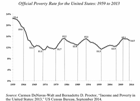
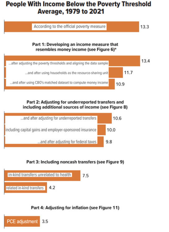
This chart "...provides a first approximation of how correcting the 2013 poverty rate for noncash food and housing benefits, refundable tax credits, and upward bias in the CPI-U would change the 2013 poverty rate. With these corrections the official poverty rate falls from 14.5 to 4.8 percent, making the 2013 rate roughly a quarter of the 1964 rate (19.0 percent). If we were to lower the poverty threshold for cohabiting couples to match that for married couples the 2013 poverty rate would have fallen even more." nybooks.com/articles/archives/2015/apr/02/war-poverty-was-it-lost/
|
||||||||||
|
Child Income Tax Credit is one of many tools to help children
|
|||||||||||
| |||||||||||
|
Food Stamps and Incentives to Work
See
Georgia's Huge Food Stamps Drop
|
|
|
Social Security
Payouts in Major Industrial Countries
|
|
Taxing the Rich 1p
Historical Trends in Income Inequality
Kludgeocracy in America
|
Lecture Notes
VIII. Market
Income
Poor Measure
1. Much of the value
provided by a smart phone was not
2.
2. Liberal View Sad Story of Wages in Americans 3. The Daily Show on Class Warfare
E. Child Safety is Not Measured but it increase of
IX.
How Income Inequality
Affects Growth
B. Would a
Wealth
Tax slow growth? |
|
 |
||
|
|
||||
|
X What About
Wealth
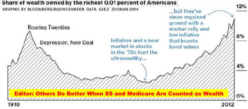
B. Including SS increase wealth at other quintiles.
C. Living longer helps everyone.
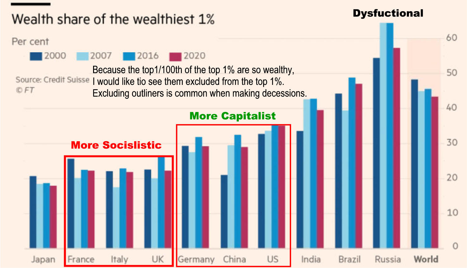
Are Americans Better Off than 2 Decade Ago Are Americans Better Off than they were a Decade or Two-Ago B. Bernanke Table 1 confirms the conventional view that, broadly measured, American living standards are comparable to those of the richest Western European nations but much higher than living standards in emerging-market economies. For example, this calculation puts economic welfare in the United Kingdom at 97 percent of U.S. levels, but estimates Mexican well-being at 22 percent. Interestingly, this comparison shows Western European countries (like the U.K., France, and Italy) as considerably closer to the U.S., in terms of economic welfare, than differences in per capita income or consumption would suggest, reflecting the fact that Western European countries do relatively well on the other criteria considered (leisure, life expectancy, inequality). For emerging and developing economies, however, differences in income or consumption per person generally understate the advantage of the United States, according to this measure, largely due to the greater levels of inequality and lower life expectancies in those countries.
|
Cato Institute's 2018 Agrees
Author's editorial! from when he started this project. A September 3,
1992 Wall Street Journal editorial by Robert Rector,
a policy analyst "Out of a total
of $184 billion in welfare spending..." This means that the actual income of those living in poverty is substantially
understated. Editors Note: In
2015 people still see the poverty percent and assume x percent
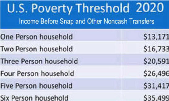
per person was not given in direct aid. Editor's Note: It has been 25 years since this analysis and still in 2017 most people do not realize that the U.S. Government publish poverty rate is before noncash transfers like SNAP (food stamps). One Columnist used the rate during the Great Recession to report 50 million mostly children were starving. "Stupid is as stupid does."
|
|||
|
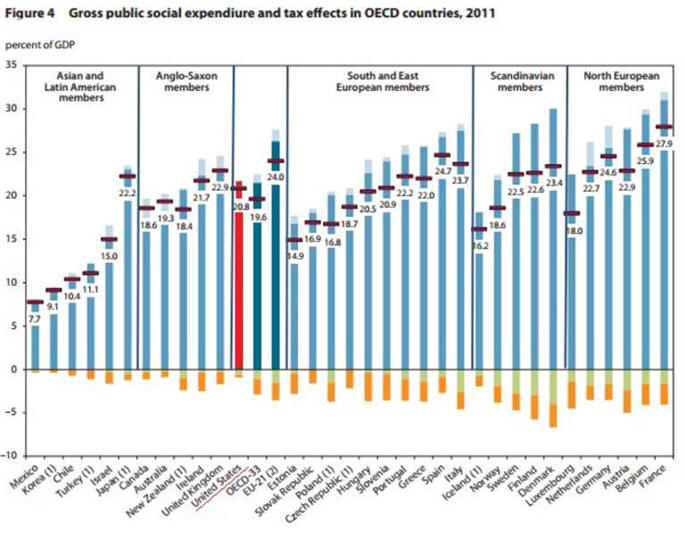
Table 2 shows that economic welfare improved at quite a rapid pace over the two decades before the crisis (1995-2007), at more than 3 percent per year, notably faster than the growth rate of per capita GDP, at about 2 percent. [8] As shown by the four rightmost columns of Table 2 and, graphically, in Figure 1, the gains in welfare were driven primarily by increases in per capita consumption and by improvements in life expectancy, which rose by 2.3 years over the period, from 75.8 to 78.1 years. Rising consumption inequality subtracted between 0.1 and 0.2 percentage points from the annualized growth rate in welfare during the pre-crisis period, and changes in leisure/work hours per person (which were stable) made only a very small contribution.
|
||||
|
|
|
|
2.
Liberal say Rich now too rich
The
US power index. The
power index, developed by Bichler
and Nitzan,
|
 https://economicsfromthetopdown.com/2020/10/05/how-the-history-of-class-struggle-is-written-on-the-stock-market/
|
|
B. Growth is Still On the Up Path. Is a Turn Coming?
|
||
| This FRED graph shows the evolution of two sources of income in our national economy: the compensation of employees through wages and other salary compensation, and the compensation of capital through profits. Both series are adjusted for inflation and both start at the level of 100 in 1954, which is the first year that�s considered �post-war� for economic purposes. (NOTE: The economic impact of the Korean War has essentially vanished.) | Eyeballing the data leads to two major conclusions. First, corporate profits move a lot, especially in response to general business activity. Profits tend to tank during recessions (noted with gray bars), which is understandable. After all, it�s well understood that investing in a business is a risky undertaking that deserves and often acquires compensation. Employee income is much more stable, but still suffers during recessions. Second, the trends of the two series tend to track each other over several decades, reflecting the general growth of the economy. The past decade and a half seems to be different, though. Never have corporate profits outgrown employee compensation so clearly and for so long. Is it because there�s been a particularly risky climate for investment, or is something else afoot? | |
|
|
� From the �Edit Graph� panel, add a series by searching for and selecting �GDP deflator,� apply formula a/b, and finally set the index value of 100 to 1954-05. Repeat for the second line.
|
Suggested by Christian Zimmermann. |
|
The US power index. The
power index, developed by Bichler
and Nitzan,
is the ratio of the S&P 500
price to the average US
wage. It measures the extent
of capitalist power
relative to workers. [Sources
and methods]
|
||
|
|
|
|
|
In Times of
Trouble Our Mixed Economy Works
|
|
|
|
|
 |
|
|
U.S. Economic Normality 1945-2015
cause and economic effect of politics
page 2
Income Inequality 2017
Income Inequality Analysis and Cures
|
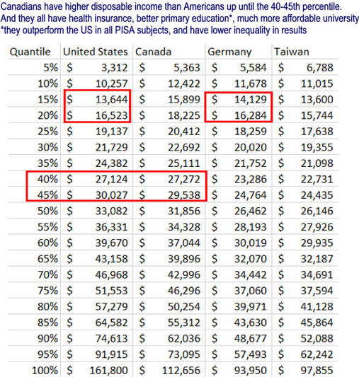
Mean Income is Higher
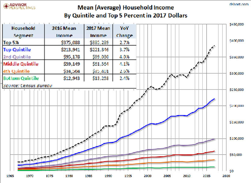
seekingalpha 4/23/13
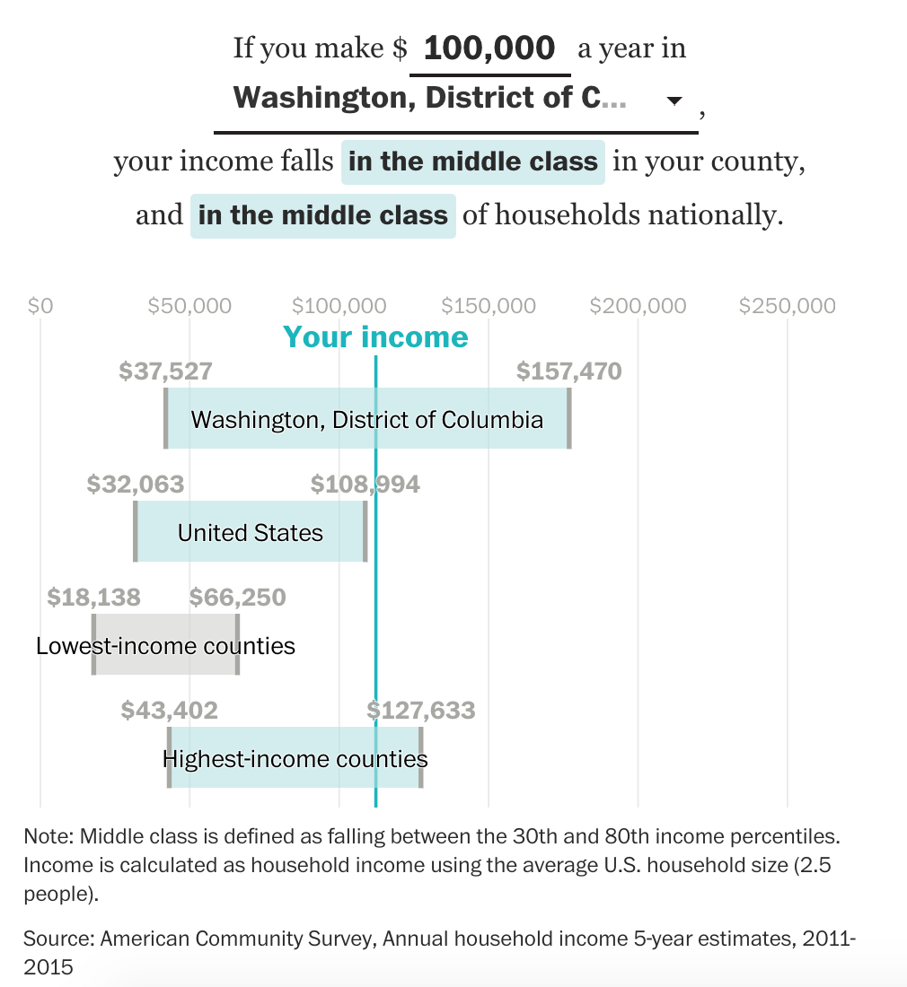
Is $100,000 Middle Class?
October 30, 2017 6:30am by Barry
Ritholtz
*Note that IPUMS-CPS microdata is top-coded and
pruned for privacy reasons,
U.S. Safety Net Bigger Than You Think, Who Are They Helping?
3.
Why Not a
Negative Income Tax
4.
Against-negative- income-tax-jim-manz
5.
Social Mobility is Low Everywhere and Always will be 2/14
Because households can be one person and families can have two workers, From America�s
Discouraging Income Story
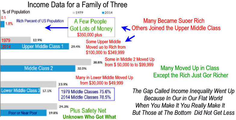
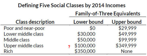
Are
Their Upper Middle Class Limits
of $100,000 to $349,000 Too High? Too Low?


Winter
2018 edition



ceo worker pay ratio America first study
Income of the 10%, 1%, and .1%
Percentile
Threshold
10.00%
1.00%
0.10%*
Individual
Income
$108,033
$300,800
$1,099,999
Household
Income
$170,432
$430,600
$1,135,421
Female
Workers
$88,005
$212,799
$800,000
Male
Workers
$128,100
$387,853
$1,099,999

But here�s your trouble: When you combine the distribution of federal
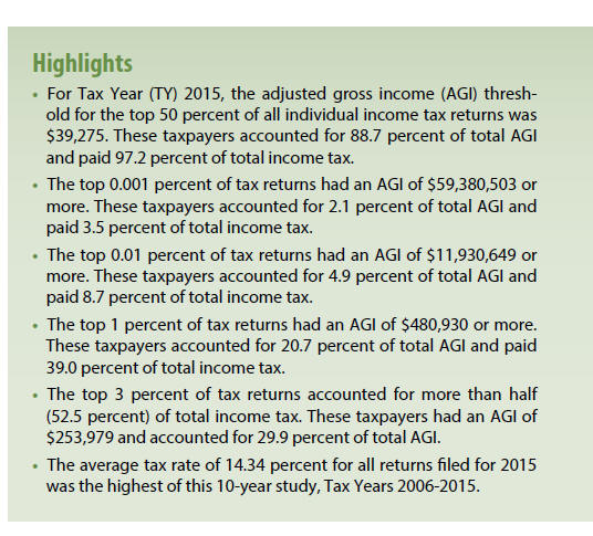
benefits and tax expenditures, you find that $32,000 goes to the top 20%
versus $24,000 a year to the bottom 20%. And a big reason for that is that
wealthier Americans get a lopsided benefit from tax breaks. More than half
of the combined benefits of the 10 largest tax expenditures go to that top
fifth of households, with 17% going to households in the top 1%.
this households declined much more than the family stagnation.
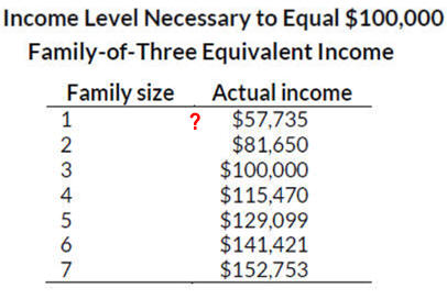
Is One Person Making
$57,734 Middle Class?
Free Library Collections
|
Career Stuff
|
Additional Information
1.
Income - Home
for census bureau data and reports.
2.
Millions live in extreme poverty here is how they get by
3.
Fight
Poverty in the U.S.
from save
the children
4.
The Bell Curve and Social Stability:
Shrink Wrapped Blog,
A Psychoanalyst Attempts to
Understand Our World
5. The Capitalism They Hate by Anthony
de Jasay
A. Part I
The Inequality Machine
B. Part II
Indecent Earnings
6.
Coming
Collapse of Middle Class - E. Warren UC Berkeley
7.
Americas-class-system-across-life-cycle has lots of data. 3/25/14
8.
Income Inequality: A Question With No Easy Answer
Burkhauser, Jeff Larrimore, and Kosali I. Simon, Nat. Tax Journal
This should be compared to the very poor "analysis" discussed
yesterday (Manhattan Institute:
The Myth of Increasing Income Inequality by Diana Furchtgott-Roth).
In this case a careful analysis reveals that such things as changes in
tax codes, in-kind benefits (such as employer-provided health
insurance) and inclusion of household make-up show less of an income
disadvantage for the middle class over the last 30 years than simply
looking at pre-tax tax unit analysis. But there still is a degradation,
not just as much. from econintersection
See Income Inequality Analysis and Cures
Election Issues 2016
Inequality and Economic Policy
Conversation with Mark Blyth: Economics and Social Justice

